Friday, February 26, 2010

Grungy Shimmery Christmas

I needed to complete my February Christmas cards to keep on track with my Quest - Complete all 40 cards by end of October, 4 a month. This month they are based on a new technique that was inspired by Tim's Perfect Distress technique - here's a link to his video.

I call this technique Perfectly Distress Background. Here are the steps:

Start with a dark card stock, here I used chocolate chip:

Apply your Distress Inks direct to paper - starting with your lightest color first:

I used 3 inks (recipe to follow) - I did not want full coverage as you you see here:

Loosely apply your Perfect Pearls, don't blend them together and again you are not looking for full coverage:

Here's what it looks like with all the Perfect Pearls applied:

Next HEAVILY mist your carstock:

Now let the water and Distress Inks work their magic (you can see them running and blending together):

Dry with your heat gun:

Here is the background completed - see the shimmer:


The recipe for this background (DI - PP):

Scattered Straw - Heirloom Gold
Peeled Paint - Green Patina
Aged Mahogany - Rust

Now the Christmas card that I made with this background:

Another view to see the shimmer:

The second Christmas card:

Another view to see the shimmer:

Recipe for Snowflake card:

Weathered Wood - Blue Patina
Faded Jeans - Blue Smoke
Black Soot - Pewter

The snowflake background was stamped using Snow Cap pigment ink - dye based inks do not stamp well over this background.

Here is a butterfly that I made stamping on the background (this will find a home later):

I hope you will give this background a try - it is Grungy Shimmery in real life!

Happy Creating!

KAT

The Stuff:
Stamps - Santa (inkadinkado), Snowflake (Here Arts)
Inks - Coffee Archival (Ranger) - all Distressed Inks listed above, Snow Cap and Pitch Black Pigment (Ranger)
Other - Perfect Pearls (listed above - Ranger), Picket Fence, Tarnished Brass Distressed Stickles
(Ranger), Gold Leafing Pen (Krylon), corners (idea-ology), Classic Frame (Spellbinders)

Thursday, February 25, 2010

ISC Challenge

Do you love layout and color challenges? Get out your Innovative Stamp Creations images and come and play along with the creative architects - you could win an ISC stamp sheet of your choice!

The Layout and Colors:

Be inspired by the above layout and colors and create a card using only ISC stamps and then head on over to the ISC blog and leave a comment to be entered for your chance to win. You have until March 7th to complete your design!

To help inspire you here is my sample Butterfly Because:

Side View:

The main panel is a reverse image stamp. I stamped the text first on vanilla card stock, inked the edges, then clear embossed the image. Then I blended with distress inks using my lightest colors first and did a final blend with my watercolor brush.

Thinking of spring - but we are expecting more snow today!

Happy Creating!

KAT

the Stuff:
Stamps - Nature Silhouette I, Assemblage, About Me, Thoughtfulness (all Innovative Stamp Creations)
Ink - Coffee Archival; Old Paper, peeled paint, fired brick, aged mahogany distress inks (Ranger)
Other - Fleur De Lis (spellbinder)

Thursday, February 18, 2010

Artful Flight

I am so into Birds... I love either birds that are realistic or silhouettes. My Niece, Kristen, is also a bird girl. This is the Valentine box that I made for her:

Artful Flight:

Notice the ribbon on the side - the top of this actually opens like a card. The flower is made with 5 layers from my Spellbinder's Flower Creations Die, smooshed up and then misted with Tattered Angels Vintage Pink glimmer mist.

Here is a side view:

What the gift printouts look like inside:

See the post below for a link to the box tutorial!

Happy Creating!

KAT

Stuff:
Stamps - Artful Flight (Stampers Anonymous)
Paper - Hey Sugar (Cosmo Cricket)
Ink - Black Archival, Spun Sugar Distress (Ranger)
Other - ticket (Jenni Bowlin), Hitch Fastener, Ornate Plate (idea-ology)

Wednesday, February 17, 2010

Artful Box

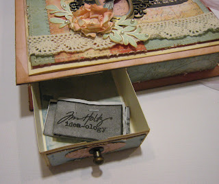
For Valentine's day I bought some of the special women in my life some Tim Holtz idea-ology products. Of course, they are not available yet (trying to wait patiently) so I wanted to have a fun way to present their gift:

Artful Artifacts:

Drawer:


Each drawer contained a print out of what was purchased - the hitch fastener opens the draw.

There are 4 Drawers:

Here is a close up:

I added some drunken scotch pieces (arrow, heart and keyhole).

I used the alphabet stamp and Snow Cap pigment ink to create the resist technique in the background.

Oh - most importantly before I sign off - I want to give credit for the fabulous box tutorial! The tutorial can be found on Kirsten's blog.

Tomorrow I'll have another box to share with a completely different look!

Happy Creating!

KAT

The Stuff:
Stamps - Artful Artifacts, Good Thoughts (Stampers Anonymous)
Ink - Snow Cap Pigment, Archival Black; Walnut Stain, Broken China, Shabby Shutters, Brushed Corduroy Distress Inks (Ranger)
Paper - Cosmo Cricket
Other - Cranberry, Ginger, Rust, Caramel, Butterscotch Alcohol Inks (Ranger), Scotch Scrapbookers Glue; Mini Grunge, Swivel Clasp, Hitch Fastener, Keys (idea-ology)

Sunday, February 14, 2010

Butterflies in Spring

I know I promised you Spring Butterflies yesterday but instead I had an early Valentine's date with my hubby. That's a BIG deal around here because he's more of a stay at home type. We went to see Avatar and had dinner. I thought Avatar was AMAZING... especially the colors in the night scenes - anyone who is involved in art an any capacity would love the vibrant colors!

So how about some vibrant Butterflies - Drunk Butterflies:


These are Alcohol Inks and silver Metallic mixatives smooshed on glossy cardstock and then the image is embossed in black. And, since the butterflies are "drunk", I sewed a stitch through the butterflies to add interest.

In Circles:

Close up of Butterfly:

Same butterfly as above stamped on Lilly Kate Basic Grey paper and pink stickles added to the detail lines.

I'm off to watch the snow fall and THINK of Spring!

KAT

The Stuff:
Stamps - Eclectic Butterfly, Nature Silhouettes, Dandelions (Innovative Stamp Creations)
Paper - Lilly Kate (Basic Grey)
Other - Steam, Wild Plum, Butterscotch, Silver Mixatives (Alcohol Inks - Ranger), Alcohol Blending Solution (Ranger)

Friday, February 12, 2010

Continuing the Spring Theme

Today how about some new Dandelions from Innovative Stamp Creations?

Dandelions in Resist


I started with white cardstock, stamped the Dandelions in black and then with Versamark stamped the Netting background and embossed, blended with distressed inks. Try this technique with any of your open image background stamps.

Puffy Dandelion

These puffy type flowers are all the rage right now - so how about a puffy dandelion? The dandelion was stamped on homemade paper and then cut with a circle punch, layered and then "smooshed".

Still waiting for early signs of Spring - tomorrow how about some butterflies!

Happy Creating!

KAT

Stuff:
Stamps - Dandelions, Netting (Innovative Stamp Creations)

Thursday, February 11, 2010

Daisy's Looking for Spring

Are you ready for Spring? I know I am! We've had lots of snow but we have been luckier than some of the folks south of us. Odd thing to say since Cleveland Ohio was voted the place of the worse winters.

The February release of stamps from Innovative Stamp Creations will help to get you in the spring mood. Today how about some Daisey's?

Delicate Daisy:

The daisy paired with Lilly Kate paper just screams spring!

Daisies For You:


Both of these cards were made using the new stamp sheet Delicate Daisy. This daisy is perfect for watercolor, wrinkle free distress technique to stamping on pattern paper (that is what I did on both of these cards and then I added a little water coloring to make them pop).

Want to see some other samples from the February release? Visit the ISC blog to see what the Creative Architect created to put you in the Spring mood.

Now if the snow would just melt...

KAT

The Stuff:
Stamp - Delicate Daisy (Innovative Stamp Creations)
Paper - Lilly Kate (Basic Grey)
Ink - Black, Coffee Archival (Ranger), Spun Sugar, Brushed Corduroy Distressed Inks (Ranger)
Other - Cuttlebug embossing folder

Wednesday, February 10, 2010

Grunge Heart and Drunken Scotch

Interesting title? Today is my first attempt at a mini tutorial and it's based on this Valentine for my husband:

Grunge Heart:

The heart is from idea-ology Element set and I based the patchwork off an inspirations piece from Tim Holtz. I flipped the heart over and actually drew lines with my ruler to determine where I would cut (I only had one large heart). And the MOST important hint I can give you if you try this is you need make a map and label the backs of your pieces so that you know where are they go to put your "heart back together" pun intended.

Here's my Map:

I painted the pieces with metallic Ranger paint dabbers (I used my map to write the paint colors on first so that I would not have pieces that were the same color or texture next to each other).

Painted Pieces:

I used the cuttlebug embossing folders to create the texture and lightly sanded each piece (in this photo only the gold ones are sanded).

Antiquing:

I then dabbed some of the black acrylic paint on my craft sheet and spritzed a puddle of water next to the paint and used my finger to antique the pieces with a mixture of the water and paint.

I then glued the heart onto heart shaped card stock, put stitching holes and wire stitched on the heart.

Drunken Scotch Tutorial

See the Rusty Key on the card? I call this technique Drunken Scotch. The steps are pretty easy...

Here are the supplies:
Cover the grunge with a generous amount of glue all over (I've only tried this clear glue):

Drop on your colors of Alcohol Inks - it will move across the glue:

Heat with your heat gun (it will bubble) and the results:

I like how this now looks like a rusted, textured key!

Here are a few other pieces:

This technique works on both grunge board and chip board.

Hope you like the technique - let me know what you think and if you give it a try!

Happy Creating!

KAT

The Stuff:
Inks - Tea Dye, Walnut Stain, Black Soot Distress Ink (Ranger)
Alcohol Inks - Rust, Ginger (Ranger)
Acrylic Paint Dabbers - Silver, Gold, Copper, Black (Ranger)
Other - Cuttlebug embossing folders, sanding block (idea-ology), Scotch Scrapbookers Glue
Elements Grungeboard (idea-ology), Tiny Attacher (idea-ology)

Thursday, February 4, 2010

It's Face Art

I wanted to play with my new Wendy Vecchi stamp set and thought Wednesday's sketch challenge on SCS would be the perfect layout.

#5 - It's Face Art:

Here's a side view:

These are the punches that I used for the flowers:


This card was made with vanilla and black cardstock, one stamp set, inks and a couple of punches. Keeping to one stamps set was the challenge for me - I like to just grab stamps from whatever when I create but I loved the images in this set and forced myself to use almost all of them.

Happy Creating!

KAT

Stuff:
Stamps - It's Face Art (Wendy Vecchi - Stampers Anonymous)
Inks - Back Archival, Distressed Inks (Ranger)

Tuesday, February 2, 2010

What Can You do With a 2 x 4....

I'm back from a successful arty weekend with my friends and I completed my projects. Today's is from this block of wood:

This idea came from posts on the Stampers Anonymous Yahoo group where they were talking about Chunky ATC's. I'd never heard of them so I did a google search. Thought, hmmm interesting, same size as an ATC on 1.5 inch piece of wood. Liked the idea but I don't like being confined to the small size of an ATC. So I measured some 2x4 stud walls that are in our storage room and what did I find.... You know a 2x4 is not actually 2 inches by 4 inches.... It's 1.5 inches thick and 3 and 3/8 inches wide... As soon as I seen the width I thought of the tags that we use with lot of Tim challenges - found my DH and presto... I have a block of wood the size of a shipping tag.

I am calling this a CHUNKY TAG:

The entire wood block is covered with old book pages using Claudine Hellmuth's Matte Multi-medium. Works kinda like modge podge BUT the adhesive is much thicker than MP and does not warp/bubble your paper. The blue background is the Wrinkle Free Distressed technique using Distressed Inks.

The rainman is stamped on grunge board, the flower on grunge paper (small Wendy Vecchi flower and I removed some of the petals to make the flower smaller). The tree trunk is a drawer pull.

The other side:

Here's the rainman again (love that image!), the butterflies (ISC) are stamped on pattern paper - some are adhered flat and others with wings bent. See Tim's idea-ology film strip at the bottom with more butterflies and hardware?

One Side (sorry this one's a little dark):

The sides are based from one of my favorite Tim Sentiment stamps "The Journey Awakens The Soul". You see parts of the stamp and metal, grungeboard and chipboard letters.

Second Side:

Top:

Another Drawer pull.

I am thrilled with how this turned out! Let me know what you think!

KAT

The Stuff:
Stamps - Mostly Tim Holtz's Stampers Anonymous, Butterflies (Innovative Stamp Creations), Flower (Wendy Vecchi Stampers Anonymous)
Paper - old book pages, butterflies from scraps
Inks - All Ranger - Archival Black, Vintage Photo, Walnut Stain, Broken China, Weathered Wood, Blue Jean
Other - Idea-ology - Grungeboard, grungepaper, film strip, washers, brads

Monday, February 1, 2010

Distressed Ink Blender Storage

I have been participating in a discussion thread in the SCS forums about Distressed Inks. There was some interest in how I store my Distressed Ink blender pads so I thought I would share that here.

Case Closed:

This is a bead/craft storage case.


Case Open:

Each Distress ink name was printed using my Dymo printer. I store both the blender pads and sponges in the same "hole".

I like to keep each color to it's own pad so that my colors will be true and not get muddy.

Thanks for the visit!

KAT

PS - I had a very successful weekend and I will be sharing my COMPLETED projects with you this week!